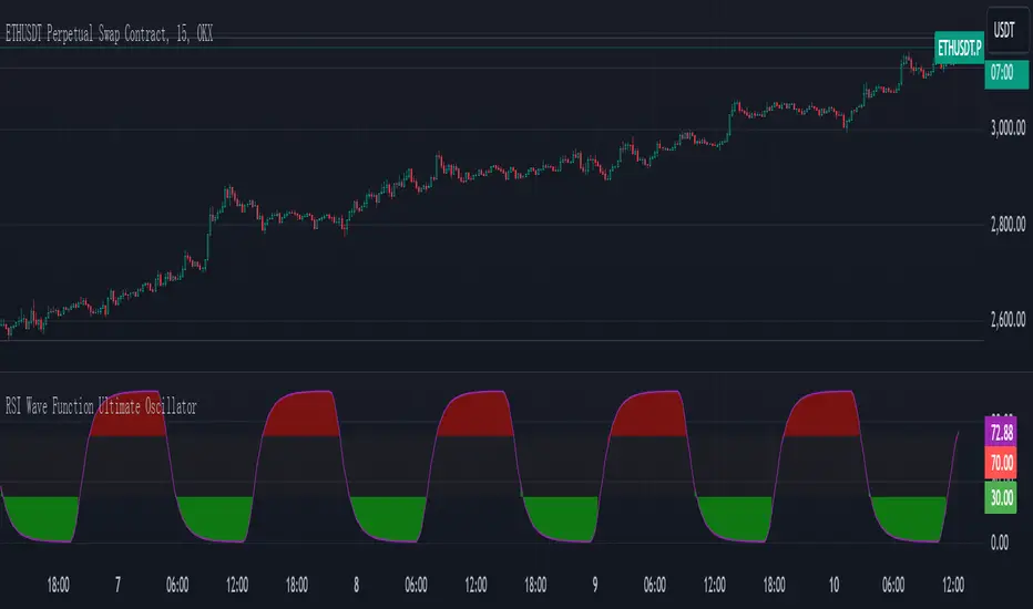
RSI Wave Function Ultimate OscillatorEnglish Explanation of the "RSI Wave Function Ultimate Oscillator" Pine Script Code
Understanding the Code
Purpose:
This Pine Script code creates a custom indicator that combines the Relative Strength Index (RSI) with a wave function to potentially provide more nuanced insights into market dynamics.
Key Components:
* Wave Function: This is a custom calculation that introduces a sinusoidal wave component to the price data. The frequency parameter controls the speed of the oscillation, and the decay factor determines how quickly the influence of past prices diminishes.
* Smoothed Signal: The wave function is applied to the closing price to create a smoothed signal, which is essentially a price series modulated by a sine wave.
* RSI: The traditional RSI is then calculated on this smoothed signal, providing a measure of the speed and change of price movements relative to recent price changes.
Calculation Steps:
* Wave Function Calculation:
* A sinusoidal wave is generated based on the bar index and the frequency parameter.
* The wave is combined with the closing price using a weighted average, where the decay factor determines the weight given to previous values.
* RSI Calculation:
* The RSI is calculated on the smoothed signal using a standard RSI formula.
* Plotting:
* The RSI values are plotted on a chart, along with horizontal lines at 70 and 30 to indicate overbought and oversold conditions.
* The area between the RSI line and the overbought/oversold lines is filled with color to visually represent the market condition.
Interpretation and Usage
* Wave Function: The wave function introduces cyclical patterns into the price data, which can help identify potential turning points or momentum shifts.
* RSI: The RSI provides a measure of the speed and change of price movements relative to recent price changes. When applied to the smoothed signal, it can help identify overbought and oversold conditions, as well as potential divergences between price and momentum.
* Combined Indicator: The combination of the wave function and RSI aims to provide a more sensitive and potentially earlier indication of market reversals.
* Signals:
* Crossovers: Crossovers of the RSI line above or below the overbought/oversold lines can be used to generate buy or sell signals.
* Divergences: Divergences between the price and the RSI can indicate a weakening trend.
* Oscillations: The amplitude and frequency of the oscillations in the RSI can provide insights into the strength and duration of market trends.
How it Reflects Market Volatility
* Amplified Volatility: The wave function can amplify the volatility of the price data, making it easier to identify potential turning points.
* Smoothing: The decay factor helps to smooth out short-term fluctuations, allowing the indicator to focus on longer-term trends.
* Sensitivity: The combination of the wave function and RSI can make the indicator more sensitive to changes in market momentum.
In essence, this custom indicator attempts to enhance traditional RSI analysis by incorporating a cyclical component that can potentially provide earlier signals of market reversals.
Note: The effectiveness of this indicator will depend on various factors, including the specific market, time frame, and the chosen values for the frequency and decay parameters. It is recommended to conduct thorough backtesting and optimize the parameters to suit your specific trading strategy.
Search in scripts for "horizontal line"
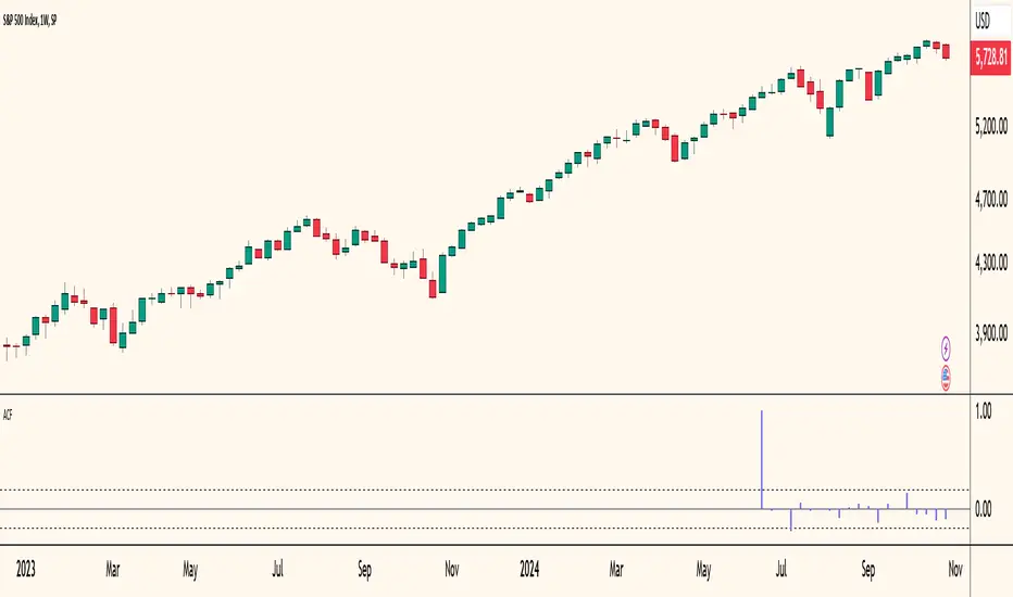
Autocorrelogram (YavuzAkbay)The Autocorrelogram (ACF) is a statistical tool designed for traders and analysts to evaluate the autocorrelation of price movements over time. Autocorrelation measures the correlation of a signal with a delayed version of itself, providing insights into the degree to which past price movements influence future price movements. This indicator is particularly useful for identifying trends and patterns in time series data, helping traders make informed decisions based on historical price behavior.
Key Components and Functionality
1. Input Parameters:
Sample Size: This parameter defines the number of data points used in the calculation of the autocorrelation function. A minimum value of 9 ensures statistical relevance. The default value is set to 100, which provides a broad view of the price behavior.
Data Source: Users can select the price data they wish to analyze (e.g., closing prices). This flexibility allows traders to apply the ACF to various price types, depending on their trading strategy.
Significance Level: This parameter determines the threshold for statistical significance in the autocorrelation values. The default value is set at 1.96, corresponding to a 95% confidence level, but users can adjust it to their preferences.
Calculate Change: This boolean option allows users to choose whether to calculate the change in the selected data source (e.g., daily price changes) rather than using the raw data. Analyzing changes can highlight momentum shifts that may be obscured in absolute price levels.
2. Core Calculations:
Simple Moving Average (SMA): The indicator computes the SMA of the selected data source over the defined sample size. This average serves as a baseline for assessing deviations in price behavior.
Variance Calculation: The variance of the price changes is calculated to understand the spread of the data. The variance is scaled by the sample size to ensure that the autocorrelation values are appropriately normalized.
Lag Value: The indicator calculates a lag value based on the sample size to determine how many periods back the autocorrelation will be calculated. This helps in assessing correlations at different time intervals.
3. Autocorrelation Calculation:
The script calculates the autocorrelation for lags ranging from 0 to 53. For each lag, it computes the autocovariance (the correlation of the signal with itself at different time intervals) and normalizes this by the variance. The result is a set of autocorrelation values that indicate the strength and direction of the relationship between current and past price movements.
4. Visualization:
The autocorrelation values are plotted as lines on the chart, with different colors indicating positive and negative correlations. Lines are dynamically drawn for each lag, providing a visual representation of how past prices influence current prices. A maximum of 54 lines (for lags 0 to 53) is maintained, with the oldest line being removed when the limit is exceeded.
Significance Levels: Horizontal lines are drawn at the defined significance levels, helping traders quickly identify when the autocorrelation values exceed the statistically significant threshold. These lines serve as benchmarks for interpreting the relevance of the autocorrelation values.
How to Use the ACF Indicator
Identifying Trends: Traders can use the ACF indicator to spot trends in the data. Strong positive autocorrelation at a given lag indicates that past price movements have a lasting influence on future movements, suggesting a potential continuation of the current trend. Conversely, significant negative autocorrelation may indicate reversals or mean reversion.
Decision Making: By comparing the autocorrelation values against the significance levels, traders can make informed decisions. For example, if the autocorrelation at lag 1 is significantly positive, it may suggest that a trend is likely to persist in the immediate future, prompting traders to consider long positions.
Setting Parameters: Adjusting the sample size and significance level allows traders to tailor the indicator to their specific market conditions and trading style. A larger sample size may provide more stable estimates but could obscure short-term fluctuations, while a smaller size may capture quick changes but with higher variability.
Combining with Other Indicators: The ACF can be used in conjunction with other technical indicators (like Moving Averages or RSI) to enhance trading strategies. Confirming signals from multiple indicators can provide stronger trade confirmations.
Price Action UltimateThe Price Action Ultimate indicator is an innovative tool designed to provide traders with a comprehensive view of price action based on either volume or touches. By default, the indicator displays touches, offering a unique perspective on price levels that have been frequently interacted with by the market.
At its core, the indicator divides the price range of a specified lookback period into a number of rows (default 25). For each row, it calculates either the volume traded or the number of times the price touched that level. This data is then visualized in two ways: as a histogram and as horizontal lines on the chart.
The histogram, displayed on the right side of the chart, represents the distribution of touches (or volume) across different price levels. Each bar in the histogram shows the number of touches and the percentage of total touches for that price level. The color of the bars ranges from a user-defined low activity color to a high activity color, providing a quick visual reference for the most active price levels.
The horizontal lines drawn across the chart represent the most significant levels based on touches (or volume). By default, the indicator displays the top 3 levels, but this can be adjusted. The thickness of these lines corresponds to the relative importance of each level - thicker lines indicate more touches or higher volume. This feature allows traders to quickly identify key support and resistance levels based on historical price action.
One of the most innovative aspects of this indicator is the option to fade older levels over time. When enabled, this feature gradually increases the transparency of lines as they age, with newer levels appearing more prominently. This helps traders focus on the most recent and relevant price action while still maintaining awareness of older, potentially significant levels.
The indicator offers flexibility in its display options. Users can choose to show levels based on volume, touches, or both. This allows traders to compare and contrast different perspectives on price action. Additionally, the indicator includes options to display a volume profile and a background fill for the analysis range, further enhancing its visual appeal and informational content.
What makes this indicator particularly valuable is its ability to provide a clear, uncluttered view of key price levels without relying on complex calculations or multiple indicators. It distills price action down to its essence - where price has spent the most time or where the most trading activity has occurred. This can be incredibly useful for identifying potential support and resistance levels, areas of consolidation, or possible breakout points.
For traders focused on price action strategies, this indicator offers a powerful tool to enhance their analysis. It provides a data-driven approach to identifying significant price levels, which can be used to inform entry and exit decisions, set stop losses, or anticipate potential market reactions.
This indicator is a tool to aid in market analysis and should not be used as the sole basis for trading decisions. Always combine multiple forms of analysis and practice proper risk management when trading. Past performance does not guarantee future results.

Liquidity VisualizerThe "Liquidity Visualizer" indicator is designed to help traders visualize potential areas of liquidity on a price chart. In trading, liquidity often accumulates around key levels where market participants have placed their stop orders or pending orders. These levels are commonly found at significant highs and lows, where traders tend to set their stop-losses or take-profit orders. The indicator aims to highlight these areas by drawing unbroken lines that extend indefinitely until breached by the price action.
Specifically, this indicator identifies and marks pivot highs and pivot lows, which are price levels where a trend changes direction. When a pivot high or pivot low is formed, it is represented on the chart with a horizontal line that continues to extend until the price touches or surpasses that level. The line remains in place as long as the level remains unbroken, which means there is potential liquidity still resting at that level.
The concept behind this indicator is that liquidity is likely to be resting at unbroken pivot points. These levels are areas where stop-loss orders or pending buy/sell orders may have accumulated, making them attractive zones for large market participants, such as institutions, to target. By visualizing these unbroken levels, traders can gain insight into where liquidity might be concentrated and where potential price reversals or significant movements could occur as liquidity is taken out.
The indicator helps traders make more informed decisions by showing them key price levels that may attract significant market activity. For instance, if a trader sees multiple unbroken pivot high lines above the current price, they might infer that there is a cluster of liquidity in that area, which could lead to a price spike as those levels are breached. Similarly, unbroken pivot lows may indicate areas where downside liquidity is concentrated.
In summary, this indicator acts as a "liquidity visualizer," providing traders with a clear, visual representation of potential liquidity resting at significant pivot points. This information can be valuable for understanding where price might be drawn to, and where large movements might occur as liquidity is targeted and removed by market participants.
Straddle Indicator - Padding GuideThe Straddle Indicator is designed to help traders visualize potential market movements by straddling the current price. This indicator draws two horizontal lines on the chart: one positioned above and one below the current price, based on user-defined offsets.
Key Features:
Dynamic Price Levels: The levels are calculated based on the current closing price, allowing the indicator to adapt to changing market conditions in real time.
Customizable Offsets: Traders can customize the offsets for the lines above and below the current price, providing flexibility to align with their trading strategies or market analysis.
Visual Clarity: The indicator displays the price levels as horizontal lines in distinct colors (green for above and red for below) along with corresponding labels showing the exact price levels, facilitating quick reference.
Current Bar Focus: The lines and labels are updated to only reflect the current bar, minimizing chart clutter and making it easy to focus on the most relevant price action.
This indicator is particularly useful for traders employing straddle strategies, as it helps to anticipate potential price movements and plan entries or exits accordingly.
Vertical Lines & Price RangeThis Pine Script indicator visually marks significant historical price points on the chart by drawing vertical lines at intervals of 6 months, 3 months, and 1 month ago. Each vertical line is accompanied by a label indicating the time frame (6M, 3M, 1M). Additionally, it calculates and displays the percentage change between the closing prices at 6 months ago and 3 months ago, as well as between 3 months ago and 1 month ago, using horizontal lines to connect these price points. This tool is useful for analyzing trends and price movements over time, providing traders with a clear visual representation of historical performance.

90 Minute Cycles Full90-Minute Cycles Indicator for London and NY Sessions
This is a more streamlined version of the 90-minute cycle indicator by sunwoo101.
The 90-Minute Cycles Indicator is built to help traders easily follow and trade around key market cycles during the London and New York sessions. Marking important 90-minute intervals and highlighting the True Cycle Open Price provides clear visual cues to help you make more informed trading decisions.
Key Features:
90-Minute Cycles for London and NY: The indicator automatically draws vertical lines marking every 90-minute cycle for the London and NY sessions. These lines are great for timing your trades and spotting potential shifts in market momentum.
True Cycle Open Price: A horizontal line is drawn at the True Cycle Open Price, which stays visible throughout the session. This gives you a key reference point for price levels that tend to act as support or resistance.
Customizable Visuals: You can fully personalize the indicator’s appearance - adjusting the colors and line styles and even controlling when the lines appear - so it blends perfectly with your existing charts.
All Cycles Drawn from the Start: Unlike other indicators, this one draws all the 90-minute cycles right when the session begins, so you can see the full day’s potential market moves as soon as the first cycle starts.
What’s Different About This Indicator:
London Session Support: In addition to the NY session, you now have 90-minute cycles for the London session, complete with its own True Cycle Open Price.
Better Customization: You have more control over the visual aspects of the indicator, so it can be tailored to fit your specific charting preferences.
Complete Cycle Visibility: All cycles are drawn immediately when the session starts, providing a full view of the day’s key moments right from the opening.
How to Use:
This indicator is perfect for scalping and short-term trading. Whether trading Forex or Indices and following SMT concepts, the cycle timing can help you pinpoint the best times for entering and exiting trades. The True Cycle Open Price is a crucial level of support or resistance throughout the session, making it a key marker to watch.
Scalpers: Use the 90-minute cycle lines to time your trades with the market's rhythm.
Day Traders: This indicator tracks the London and NY sessions, making it an excellent tool for day trading strategies where timing is critical.
Multi-Session Support:
Whether you're trading the London or New York session, the indicator will automatically adjust to your time zone and align the cycles to the relevant session. This helps you stay on top of key market activity across major trading hubs without changing anything manually.

NYSE VOLD RatioThe UVOL/DVOL Two-Sided Ratio Histogram is a custom indicator that visualizes the relationship between the up volume ( USI:UVOL ) and down volume ( USI:DVOL ) on any given chart timeframe. The indicator dynamically adjusts to the chart’s timeframe and displays the ratio of USI:UVOL to USI:DVOL in a histogram format, making it easy to spot when the up volume exceeds down volume (and vice versa).
The ratio is calculated as follows:
If USI:UVOL > USI:DVOL : The ratio is USI:UVOL / USI:DVOL , displayed as a positive bar.
If USI:DVOL > USI:UVOL : The ratio is USI:DVOL / USI:UVOL , displayed as a negative bar.
This approach allows traders to quickly gauge market sentiment by comparing buying volume to selling volume. The indicator is centered around a zero line, where:
Positive bars indicate that up volume is stronger than down volume.
Negative bars indicate that down volume is stronger than up volume.
Features:
Dynamic Timeframe: Automatically adjusts to the chart’s selected timeframe.
Two-Sided Histogram: Displays positive and negative bars based on the $UVOL/ USI:DVOL ratio.
Zero Reference Line: A clear horizontal line at 0 to help identify shifts in volume dominance.
Easy Volume Sentiment Analysis: Quickly spot trends in market buying vs. selling pressure.
Use Case:
This indicator is ideal for traders who want a quick, visual representation of market sentiment by comparing volume on the upside (buying pressure) versus downside (selling pressure). It can be used for identifying strong buying or selling pressure and potential reversal points.

UTS Chronos LevelsThis indicator, called "UTS Chronos Levels ", is a Pine Script (version 5) overlay for Trading View charts.
Purpose:
The indicator displays key price levels from previous time periods (day, week, and month) on the chart. These levels can be used to identify potential support and resistance areas.
Levels Displayed:
Previous Day's High and Low
Previous Week's High and Low
Previous Month's High and Low
Visual Representation:
Each level is represented by a horizontal line extending from the start of the respective period to the current bar.
Lines are color-coded for easy identification:
• Previous Day: Green (High) and Red (Low)
• Previous Week: Blue (High) and Purple (Low)
• Previous Month: Teal (High) and Maroon (Low)
Labels:
Each line is accompanied by a label indicating the level it represents (e.g., "Prev D High", "Prev W Low", etc.).
Dynamic Updates:
The indicator detects new days, weeks, and months using the ta.change() function.
Lines and labels are updated at the start of each new period.
Efficiency:
The script uses persistent variables to store start points of periods and line objects.
Lines are redrawn on each last bar to prevent overcrowding and ensure up-to-date information.
Potential Use Cases:
Identifying potential support and resistance levels
Analyzing price action around previous period highs and lows
Developing trading strategies based on breakouts or rejections from these levels
This indicator can be particularly useful for traders who incorporate multi-timeframe analysis in their trading decisions, providing a quick visual reference for key levels from different time periods on a single chart.

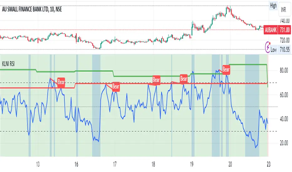
KLNI RSI MTFDescription of the RSI Multi-Timeframe Indicator
The RSI Multi-Timeframe Indicator allows you to track and compare the Relative Strength Index (RSI) across three different timeframes on the same chart. This is particularly useful for traders who want to gauge the momentum of an asset over multiple time periods simultaneously, helping to make more informed trading decisions.
Key Features
Multi-Timeframe RSI:
You can select up to three timeframes to plot RSI on the same chart.
Available timeframe options include:
Current: Displays RSI for the current chart timeframe.
60 minutes (1 hour)
Daily
Weekly
Monthly
Custom RSI Settings:
Adjust the RSI length and source (e.g., close price) through user inputs, allowing you to tailor the indicator to your strategy.
Divergence Detection (Optional):
The indicator can optionally detect and display bullish and bearish divergences between price and RSI for the first selected timeframe.
Bullish divergence is shown when price makes a lower low, but RSI makes a higher low.
Bearish divergence is shown when price makes a higher high, but RSI makes a lower high.
Visual Aids:
Overbought and oversold RSI levels are highlighted with background colors for clarity.
Horizontal lines at 70 (overbought), 50 (neutral), and 30 (oversold) help quickly identify RSI conditions.
How to Use This Indicator
Inputs & Settings
Timeframe Settings:
First Timeframe: Choose the primary timeframe (e.g., 60 minutes, Daily, Weekly).
Second Timeframe: Select the second timeframe to plot on the chart.
Third Timeframe: Select the third timeframe for additional RSI analysis.
RSI Settings:
RSI Length: Set the period for RSI calculation (default: 14).
Source: Select the price data for RSI calculation (default: close price).
Show Divergence: Enable or disable the detection of divergence between price and RSI.
Plotting on Chart
The indicator will display three distinct RSI plots for the selected timeframes:
RSI TF1 (blue line) for the first timeframe.
RSI TF2 (green line) for the second timeframe.
RSI TF3 (red line) for the third timeframe.
Each RSI line corresponds to its chosen timeframe, allowing you to see how RSI behaves across different time periods.
Reading the RSI Values
Overbought: When RSI is above 70, the asset is considered overbought, potentially signaling a sell or short entry.
Oversold: When RSI is below 30, the asset is considered oversold, possibly indicating a buying opportunity.
Neutral: RSI around 50 is neutral and may suggest a lack of clear momentum.
Divergence Detection
If enabled, the indicator will highlight points of divergence:
Bullish Divergence: A green label will appear below the chart where price is making lower lows, but RSI is making higher lows, suggesting potential bullish momentum.
Bearish Divergence: A red label will appear when price is making higher highs, but RSI is making lower highs, indicating potential bearish pressure.
Practical Applications
Momentum Confirmation: Use this indicator to confirm the strength of a trend by comparing RSI across multiple timeframes. For example, if RSI is above 50 on all three timeframes, it may confirm strong upward momentum.
Overbought/Oversold Signals: When RSI is overbought on multiple timeframes, it could signal an impending reversal or correction. Conversely, oversold conditions across timeframes might indicate a buy opportunity.
Divergence Detection: Spot divergence between price and RSI to identify potential trend reversals early. Divergence can provide early signals of changing market momentum.
Summary
This indicator is a powerful tool for multi-timeframe RSI analysis, helping traders understand momentum shifts across different timeframes. It offers customizability, divergence detection, and visual aids to streamline your technical analysis and decision-making process.
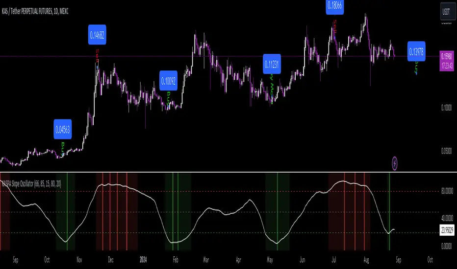
KASPA Slope OscillatorKASPA Slope Oscillator for analyzing KASPA on the 1D (daily) chart.
The indicator is plotted in a separate pane below the price chart and uses a mathematical approach to calculate and visualize the momentum or "slope" of KASPA's price movements.
Input Parameters:
Slope Window (days):
Defines the period (66 days by default) over which the slope is calculated.
Normalization Window (days):
The window size (85 days) for normalizing the slope values between 0 and 100.
Smoothing Period:
The number of days (15 days) over which the slope values are smoothed to reduce noise.
Overbought and Oversold Levels:
Threshold levels set at 80 (overbought) and 20 (oversold), respectively.
Calculation of the Slope:
Logarithmic Price Calculation:
Converts the close price of KASPA into a logarithmic scale to account for exponential growth or decay.
Rolling Slope:
Computes the rate of change in logarithmic prices over the defined slope window.
Normalization:
The slope is normalized between 0 and 100, allowing easier identification of extreme values.
Smoothing and Visualization:
Smoothing the Slope:
A Simple Moving Average (SMA) is applied to the normalized slope for the specified smoothing period.
Plotting the Oscillator:
The smoothed slope is plotted on the oscillator chart. Horizontal lines indicate overbought (80), oversold (20), and the mid-level (50).
Background Color Indications:
Background colors (red or green) indicate when the slope crosses above the overbought or below the oversold levels, respectively, signaling potential buy or sell conditions.
Detection of Local Maxima and Minima:
The code identifies local peaks (maxima) above the overbought level and troughs (minima) below the oversold level.
Vertical background lines are highlighted in red or green at these points, signaling potential reversals.
Short Summary:
The oscillator line fluctuates between 0 and 100, representing the normalized momentum of the price.
Red background areas indicate periods when the oscillator is above the overbought level (80), suggesting a potential overbought condition or a sell signal.
Green background areas indicate periods when the oscillator is below the oversold level (20), suggesting a potential oversold condition or a buy signal.
The vertical lines on the background mark local maxima and minima where price reversals may occur.
(I also want to thank @ForgoWork for optimizing visuality and cleaning up the source code)
Volumatic S/R Levels [BigBeluga]THE VOLUMATIC S/R LEVELS
The Volumatic S/R Levels [ BigBeluga ] is an advanced technical analysis tool designed to identify and visualize significant support and resistance levels based on volume and price action.
The core concept of this indicator is to highlight areas where large volume and significant price movements coincide. It does this by plotting horizontal lines at price levels where unusually large candles (in terms of price range) occur alongside high trading volume. These lines represent potential support and resistance levels that are likely to be more significant due to the increased market activity they represent.
⬤ Key Features
Dynamic S/R Level Identification: Automatically detects and displays support and resistance levels from high volume candles.
Volume-Weighted Visualization: Uses line color to see positive or negative volume and box size to represent the strength of each level
Positive and Negative Volume:
Box Size Based on Volume:
Adaptive Levels Color: Adjusts level color based on price above or below level
Real-time Level Extension: Extends identified levels to the right side of the chart for better visibility
Volume and Percentage Labels: Displays volume information and relative strength percentage for each level
Dashed Levels: Displays levels with which price have interact multiple times
Dashboard: Shows max and min level information for quick reference
⬤ How to Use
Identify Key Levels: Look for horizontal lines representing potential support and resistance areas
Assess Level Strength:
- Thicker boxes indicate stronger levels, on which price reacts more
Monitor Price Interactions: Watch how price reacts when approaching these levels for potential trade setups
Volume Confirmation: Use the volume boxes to confirm the significance of each level
Relative Strength Analysis: Check the percentage labels to understand each level's importance relative to others
Trend Analysis: Use the color of the levels (lime for bullish, orange for bearish) to understand the overall market sentiment at different price points
Quick Reference: Utilize the dashboard to see the strongest and weakest levels at a glance
⬤ Customization
Levels Strength: Adjust the minimum threshold for level strength identification (default: 2.4)
Levels Amount: Set the maximum number of levels to display on the chart (max: 20)
The Volumatic S/R Levels indicator provides traders with a sophisticated tool for identifying key price levels backed by significant volume. By visualizing these levels directly on the chart and providing detailed volume and relative strength information, it offers valuable insights into potential areas of support, resistance, and price reversal. The addition of a ranking system and dashboard further enhances the trader's ability to quickly assess the most significant levels. This indicator is particularly useful for traders focusing on volume analysis and those looking to enhance their understanding of market structure. As with all technical tools, it's recommended to use this indicator in conjunction with other forms of analysis for comprehensive trading decisions.

Monthly Day Long Strategy with VIX and Risk ManagementThis trading strategy is designed to open long positions on a specific day of the month, with the conditions for entry and exit based on the VIX index and additional risk management techniques. The strategy includes stop-loss and take-profit features to manage risk and lock in profits.
Inputs:
Entry Day of the Month (entry_day): Specifies which day of the month to consider for initiating a trade. The default value is the 27th.
Hold Duration (Days) (hold_duration_days): Defines how many days to hold the position after opening. The default value is 4 days.
VIX Threshold (vix_threshold): Sets the maximum acceptable value for the VIX index to consider an entry. If the VIX is below this threshold, it signals a potential trade. The default value is 20.0.
Stop Loss (%) (stop_loss_percentage): Determines the percentage below the entry price where the stop-loss will be triggered. The default value is 2.0%.
Take Profit (%) (take_profit_percentage): Sets the percentage above the entry price where the take-profit will be triggered. The default value is 5.0%.
Functions:
next_weekday(date): Adjusts the entry date to the next Monday if it falls on a weekend (Saturday or Sunday). This ensures trades do not occur on non-trading days.
Logic:
Entry Conditions:
Date Check: Opens a long position if the current date matches the adjusted entry date (the 27th or the next Monday if the 27th falls on a weekend).
VIX Filter: The VIX index value must be below the specified threshold (e.g., 20.0) to consider an entry.
Exit Conditions:
Time-Based Exit: Closes the position after the hold duration of 4 days.
Stop-Loss: Automatically closes the position if the price drops to a level that is a specified percentage below the entry price (e.g., 2.0%).
Take-Profit: Closes the position if the price rises to a level that is a specified percentage above the entry price (e.g., 5.0%).
Plots:
VIX Plot: Displays the VIX index on the chart for visual reference.
VIX Threshold Line: A horizontal line representing the VIX threshold value.
Summary:
The strategy aims to take advantage of specific entry days while filtering trades based on VIX levels to ensure market conditions are favorable. Risk management is enhanced through stop-loss and take-profit settings, which help in controlling potential losses and securing profits. The strategy ensures trades are only made on trading days and not on weekends, adjusting automatically to the next Monday if needed.
ChatGPT kann Fehler machen. Überprüfe wichtige Informationen.

Price Oscillator TR### Summary: How to Use the Price Oscillator with EMA Indicator
The **Price Oscillator with EMA** is a custom technical analysis tool designed to help traders identify potential buying and selling opportunities based on price momentum. Here's how to use it:
1. **Understanding the Oscillator**:
- The oscillator is calculated by normalizing the current price relative to the highest high and lowest low over a specified lookback period. It fluctuates between -70 and +70.
- When the oscillator is near +70, the price is close to the recent highs, indicating potential overbought conditions. Conversely, when it’s near -100, the price is close to recent lows, indicating potential oversold conditions.
2. **Exponential Moving Average (EMA)**:
- The indicator includes an EMA of the oscillator to smooth out price fluctuations and provide a clearer signal.
- The EMA helps to filter out noise and confirm trends.
3. **Trading Signals**:
- **Bullish Signal**: A potential buying opportunity is signaled when the oscillator crosses above its EMA. This suggests increasing upward momentum.
- **Bearish Signal**: A potential selling opportunity is signaled when the oscillator crosses below its EMA. This indicates increasing downward momentum.
4. **Visual Aids**:
- The indicator includes horizontal lines at +70, 0, and -70 to help you quickly assess overbought, neutral, and oversold conditions.
- The blue line represents the oscillator, while the orange line represents the EMA of the oscillator.
### How to Use:
- **Set your parameters**: Adjust the lookback period and EMA length to fit your trading strategy and time frame.
- **Watch for Crossovers**: Monitor when the oscillator crosses the EMA. A crossover from below to above suggests a buy, while a crossunder from above to below suggests a sell.
- **Confirm with Other Indicators**: For more reliable signals, consider using this indicator alongside other technical tools like volume analysis, trend lines, or support/resistance levels.
This indicator is ideal for traders looking to capture momentum-based trades in various market conditions.
SP500 Earnings Yield Spread: SP500 vs 3 Month & 10 Year TreasuryAdd the SP500 ttm Earnings Yield Spreads vs the 3 Month and 10 Year Treasury Rates.
Short Spread = SP500 E/P ttm - 3 Month Treasury Rate
Long Spread = SP500 E/P ttm - 10 Year Treasury Rate
Symbol "SP500_EARNINGS_YIELD_MONTH" as the SP500 Earnings Yield
Symbol "US03MY" as the 3 Month Treasury Rate
Symbol "US10Y" as the 10 Year Treasury Rate
Based on research suggesting Earnings Yield and Interest Rates may have predictive power of future returns:
- Market-Timing Strategies That Worked? - Pu Shen
- Valuation Ratios and the Long-Run Stock Market Outlook - Campbell and Shiller
Inputs:
Short Term Spread - Line for Short Term Spread
Long Term Spread - Line for Long Term Spread
Zero Line - Horizontal line at 0
Color Lines Based on Spread - Color the spreads green/red if spread is positive/negative
Short 10th PCT - Line for Short Term Spread 10th percentile of historical values
Long 10th PCT - Line for Long Term Spread 10th percentile of historical values
Shade Below 10 PCT: Spread Must be Negative - Requirement the spread is negative to shade background
Shade Background Below Short 10th Percentile - Shade the background if the Short Term Spread is below its 10th percentile. (and spread is negative if input above chosen)
Shade Background Below Long 10th Percentile - Shade the background if the Long Term Spread is below its 10th percentile. (and spread is negative if input above chosen)

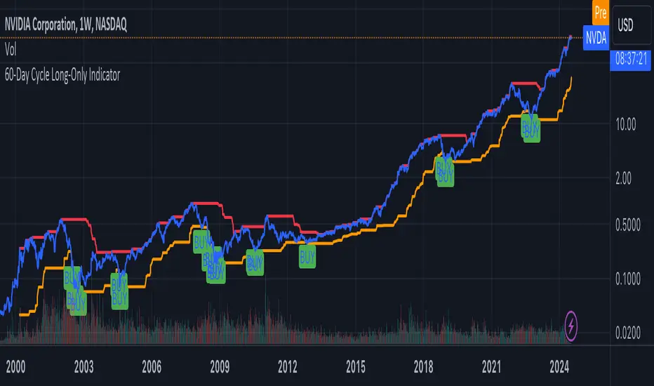
60-Day Cycle Long-Only IndicatorThe following indicator generates ‘Buy’ signals based on rotating 60-day cycles. The general theory is that when buying strong, growth-oriented assets, 60-day micro-cycles culminate into larger macro-cycles.
Summary:
Explaining the Upper and Lower Bounds in the 60-Day Cycle Strategy:
1. Cycle High (Upper Bound):
The cycle high is the highest closing price of the asset over the past 60 days. This value acts as the upper boundary of the 60-day cycle, indicating the peak price level during this period. When the current closing price is above this boundary, it suggests a potential distribution phase, where the asset might be overbought, and larger players may be selling off their positions. In the strategy, the cycle high is plotted as a red line on the chart, helping traders visually identify the upper limit of the 60-day trading range.
2. Cycle Low (Lower Bound):
The cycle low is the lowest closing price of the asset over the past 60 days. This value acts as the lower boundary of the 60-day cycle, indicating the trough price level during this period. When the current closing price is below this boundary, it suggests a potential accumulation phase, where the asset might be oversold, and larger players may be accumulating positions at lower prices. In the strategy, the cycle low is plotted as an orange line on the chart, helping traders visually identify the lower limit of the 60-day trading range.
How These Bounds Are Calculated:
• Cycle High: Calculated using the highest closing price over the last 60 trading days. In Pine Script, this is achieved with the function ta.highest(close, cycle_length), where cycle_length is set to 60 days.
• Cycle Low: Calculated using the lowest closing price over the last 60 trading days. In Pine Script, this is achieved with the function ta.lowest(close, cycle_length), where cycle_length is set to 60 days.
Interpretation and Application:
• Buy Signal: A buy signal is generated when the closing price crosses above the cycle low. This indicates a potential end to the bearish phase and the start of a bullish trend.
• Distribution Phase: When the closing price crosses above the cycle high, it suggests the market is in a distribution phase, potentially signaling a bearish trend or a sell-off period.
Example:
On a trading chart, the cycle high and cycle low are plotted as horizontal lines, with their colors distinguishing them (red for cycle high and orange for cycle low). These lines create a visual range within which the asset's price has moved over the last 60 days, helping traders quickly assess whether the current price is near the upper or lower bound.
By identifying and plotting these upper and lower bounds, traders can better understand the current market phase and make more informed trading decisions based on the 60-day cycle strategy. This indicator can be used across various assets.
Relative Equal Highs/LowsThis Pine script indicator is designed to create a visual representation of the relative equal highs & lows formed and automatically removed mitigated ones. Unlike indicators designed to show exact equal high/lows this indicator allows a small, configurable degree of variance between price to identify areas where price stops.
Relevance:
Relative Equal highs and lows can serve as valuable tools in identifying potential shifts in trend direction. They come into play when the price hits a support or resistance level and can’t advance further, signaling a possible reversal or pivot point. When the price sufficiently retreats from these levels, relative equal highs and lows can also indicate liquidity draws where buy/sell stops might be positioned, in accordance with SMC/ICT concepts.
How It Works:
The indicator tracks all unmitigated highs & lows within the chart’s present timeframe, limited to the user-defined max bars lookback for optimal performance. If the prices are within the configured variance they are marked as relatively equal and at that point are visually identified by a horizontal line, which connects the two (or more) points of price. Depending on configuration of the indicator, a line is rendered from the 1st, last or both values within the relatively equal range of price. A unique feature of this indicator is its ability to remove the line once the price mitigates the relative equal high/low by falling below the lows or rising above highs. This ensures the chart remains uncluttered and highlights only the currently relevant levels, setting it apart from other indicators providing similar functionality.
Configurability:
The indicator offers five style settings for complete customization of the lines that represent equal highs/lows. These settings include line style, color, and width, along with an option to extend the lines to the right of the chart for enhanced visibility of equal high/low levels. To optimize performance, the indicator allows users to configure the lookback length, determining how far back the price history should be examined. In most instances, the default setting of 500 bars proves more than adequate. Additionally, you can set thresholds via separate configs for stocks & indices that will determine if the price is relatively equal and lastly allow you to configure where the indicator line should be drawn, the first, last or all the values.
Additional notes:
This uses a different approach then my “equal highs/lows” indicator to identify price levels and because it focuses specifically on relative as opposed to exact values it is entirely different and may show “weaker”, but still important levels of liquidity. This indicator is more suited for analysis of stocks and indices or higher-timeframes where price-action rarely forms exact equal values instead more frequently forming almost equal values. My other indicator is more suited for smaller (15m or less) timeframe on indices where exact equal prices are often identical. Depending on situation different indicators should be used.

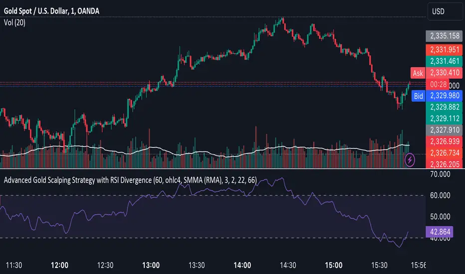
Advanced Gold Scalping Strategy with RSI Divergence# Advanced Gold Scalping Strategy with RSI Divergence
## Overview
This Pine Script implements an advanced scalping strategy for gold (XAUUSD) trading, primarily designed for the 1-minute timeframe. The strategy utilizes the Relative Strength Index (RSI) indicator along with its moving average to identify potential trade setups based on divergences between price action and RSI movements.
## Key Components
### 1. RSI Calculation
- Uses a customizable RSI length (default: 60)
- Allows selection of the source for RSI calculation (default: close price)
### 2. Moving Average of RSI
- Supports multiple MA types: SMA, EMA, SMMA (RMA), WMA, VWMA, and Bollinger Bands
- Customizable MA length (default: 3)
- Option to display Bollinger Bands with adjustable standard deviation multiplier
### 3. Divergence Detection
- Implements both bullish and bearish divergence identification
- Uses pivot high and pivot low points to detect divergences
- Allows for customization of lookback periods and range for divergence detection
### 4. Entry Conditions
- Long Entry: Bullish divergence when RSI is below 40
- Short Entry: Bearish divergence when RSI is above 60
### 5. Trade Management
- Stop Loss: Customizable, default set to 11 pips
- Take Profit: Customizable, default set to 33 pips
### 6. Visualization
- Plots RSI line and its moving average
- Displays horizontal lines at 30, 50, and 70 RSI levels
- Shows Bollinger Bands when selected
- Highlights divergences with "Bull" and "Bear" labels on the chart
## Input Parameters
- RSI Length: Adjusts the period for RSI calculation
- RSI Source: Selects the price source for RSI (close, open, high, low, hl2, hlc3, ohlc4)
- MA Type: Chooses the type of moving average applied to RSI
- MA Length: Sets the period for the moving average
- BB StdDev: Adjusts the standard deviation multiplier for Bollinger Bands
- Show Divergence: Toggles the display of divergence labels
- Stop Loss: Sets the stop loss distance in pips
- Take Profit: Sets the take profit distance in pips
## Strategy Logic
1. **RSI Calculation**:
- Computes RSI using the specified length and source
- Calculates the chosen type of moving average on the RSI
2. **Divergence Detection**:
- Identifies pivot points in both price and RSI
- Checks for higher lows in RSI with lower lows in price (bullish divergence)
- Checks for lower highs in RSI with higher highs in price (bearish divergence)
3. **Trade Entry**:
- Enters a long position when a bullish divergence is detected and RSI is below 40
- Enters a short position when a bearish divergence is detected and RSI is above 60
4. **Position Management**:
- Places a stop loss order at the entry price ± stop loss pips (depending on the direction)
- Sets a take profit order at the entry price ± take profit pips (depending on the direction)
5. **Visualization**:
- Plots the RSI and its moving average
- Draws horizontal lines for overbought/oversold levels
- Displays Bollinger Bands if selected
- Shows divergence labels on the chart for identified setups
## Usage Instructions
1. Apply the script to a 1-minute XAUUSD (Gold) chart in TradingView
2. Adjust the input parameters as needed:
- Increase RSI Length for less frequent but potentially more reliable signals
- Modify MA Type and Length to change the sensitivity of the RSI moving average
- Adjust Stop Loss and Take Profit levels based on current market volatility
3. Monitor the chart for Bull (long) and Bear (short) labels indicating potential trade setups
4. Use in conjunction with other analysis and risk management techniques
## Considerations
- This strategy is designed for short-term scalping and may not be suitable for all market conditions
- Always backtest and forward test the strategy before using it with real capital
- The effectiveness of divergence-based strategies can vary depending on market trends and volatility
- Consider using additional confirmation signals or filters to improve the strategy's performance
Remember to adapt the strategy parameters to your risk tolerance and trading style, and always practice proper risk management.
Uptrick:Intensity IndexPurpose:
The "Uptrick: Intensity Index" strategy is designed to provide traders with insights into the trend intensity of security by combining multiple moving averages and their relative positions. This versatile tool can be used effectively by both short-term and long-term traders to identify potential buy and sell signals based on specific conditions.
Explanation:
Input Parameters and Customization:
Moving Averages Lengths:
Adjust MA1, MA2, and MA3 lengths to change the calculation periods for the moving averages.
Trend Intensity Index SMA Length:
Adjust the length of the SMA applied to the TII.
Plot Colors:
Change the colors of the TII and TII MA plots for better visualization.
Background Colors and Transparency:
Set different colors for positive and negative TII MA values.
Control the transparency of the background color.
---------------------------------------------------------------------------
MA1 (Length 10): Short-term moving average, useful for capturing short-term market trends.
MA2 (Length 20): Medium-term moving average, providing a balanced view of market trends.
MA3 (Length 50): Long-term moving average, offering insights into long-term market trends.
The script calculates the relative positions of the closing price to each moving average (rel1, rel2, rel3) to determine how far the current price deviates from each average.
Trend Intensity Index (TII):
The TII is calculated as the average of the relative positions (rel1, rel2, rel3), multiplied by 100 to convert it into a percentage. This index reflects the overall intensity of the trend, considering short-term, medium-term, and long-term perspectives.
The TII is plotted in blue, providing a visual representation of trend intensity.
SMA of TII:
An additional SMA is applied to the TII (matii) to smooth out fluctuations and provide a clearer long-term trend signal.
The SMA of TII is plotted in orange, offering a reference for long-term trend analysis.
Determining Potential Price Movements:
For Short-Term Traders:
When the blue TII line crosses above the orange SMA of TII line, it indicates a potential buy signal.
When the blue TII line crosses below the orange SMA of TII line, it indicates a potential sell signal.
For Long-Term Traders:
When the orange SMA of TII line crosses above the highlighted 0 line, it indicates a potential buy signal.
When the orange SMA of TII line crosses below the highlighted 0 line, it indicates a potential sell signal.
Plotting and Visualization:
The TII and its SMA are plotted with distinct colors for easy identification.
A horizontal line at 0 is plotted in gray to serve as a reference point for long-term trend signals.
The background color changes based on the value of the SMA of TII (matii):
Green background for matii values above 0, indicating bullish conditions.
Red background for matii values below 0, indicating bearish conditions.
Utility and Potential Usage:
The "Uptrick: Intensity Index" indicator is a powerful tool for both short-term and long-term traders, offering clear buy and sell signals based on the crossover of the TII and its SMA, as well as the position of the SMA relative to the zero line.
By consolidating multiple moving averages and their relative positions into a single indicator, traders can gain comprehensive insights into market trends and intensity.
The ability to adjust all inputs and toggle visibility options enhances the flexibility and utility of the indicator, making it suitable for various trading styles and market conditions.
Through its versatile design and advanced features, the "Uptrick: Intensity Index" indicator equips traders with actionable insights into trend intensity and potential price movements. By integrating this robust tool into their trading strategies, traders can navigate the markets with greater precision and confidence, thereby enhancing their trading outcomes.
WHAT SETTINGS TO HAVE FOR THE MOVING AVERAGE:
Short-term traders (day traders) might prefer a shorter SMA length (e.g., 5-20 periods) as they are looking for quick signals and react to price changes more rapidly.
Medium-term traders (swing traders) might opt for a medium SMA length (e.g., 20-50 periods) which can filter out some noise and provide a clearer signal on the trend.
Long-term traders (position traders) might choose a longer SMA length (e.g., 50-200 periods) to get a broader view of the market trend and avoid reacting to short-term fluctuations.

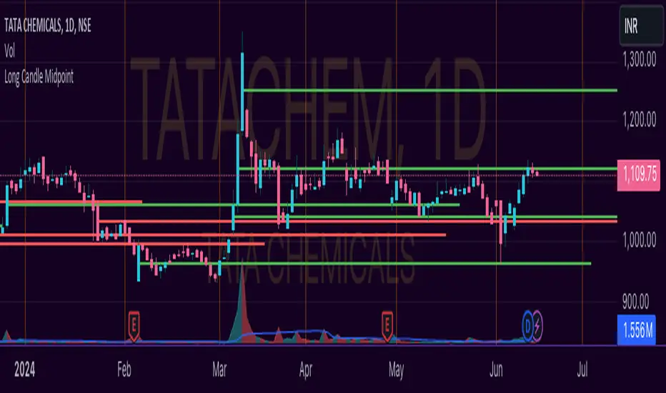
Unlocking the Power of Long Candle MidpointI'm excited to share with you a fascinating concept that can help you identify potential breakout points in the market.
The Pine Script code provided below is designed to identify the midpoint of a long candle, which can be a crucial level for traders to watch.
In this blog post, we'll dive deeper into the concept, explore its applications, and analyze a real-life example of TATACHEM listed on NSE, which is currently trading around a potential psychology line.
What is the Long Candle Midpoint?
The long candle midpoint is a technical indicator that calculates the midpoint of a candlestick that has a significant price movement. This midpoint is then used to draw a horizontal line, which can serve as a potential support or resistance level. The idea is that if a candlestick has a large price movement, it's likely that the market will react to this movement by testing the midpoint of the candle.
How Does the Long Candle Midpoint Indicator Work?
The Pine Script code provided above is designed to calculate the midpoint of a long candle based on the following parameters:
Length: The length of the candlestick is calculated using the len input parameter.
Line Length: The length of the line is calculated using the linExt input parameter.
Calculation Method: The calculation method can be set to either "Highest True Range", "Average True Range", or "Both".
Multiplier: The multiplier is used to adjust the midpoint calculation based on the average range of the candlestick.
The script then plots a horizontal line at the midpoint of the long candle, which can be used as a potential support or resistance level.
Real-Life Example:
Let's take a look at TATACHEM, a stock listed on the National Stock Exchange of India (NSE). As you can see in the chart below,
TATACHEM has been trading around a potential psychology line drawn from the midpoint of a large candle.
As you can see, the stock has previously failed to break above this line, but it's currently trading around it. This could be a sign that the market is preparing for a potential breakout. If the stock can break above this line, it could lead to a bullish rally.
Conclusion
The long candle midpoint indicator is a powerful tool that can help traders identify potential breakout points in the market. By analyzing the midpoint of a long candle, traders can gain insights into the market's sentiment and potential areas of support or resistance.
In the case of TATACHEM, the stock is currently trading around a potential psychology line, which could be a sign of a potential breakout. Traders can consider this point in their watch list for a potential entry. Tips for Traders
Use the long candle midpoint indicator in conjunction with other technical indicators to gain a more comprehensive understanding of the market.
Look for confirmation from other indicators before entering a trade.
Set stop-loss and take-profit levels based on the potential breakout point.
Monitor the market closely and be prepared to adjust your strategy if the market doesn't behave as expected.
By incorporating the long candle midpoint indicator into your trading strategy, you can gain an edge in the market and make more informed trading decisions.
Horizontal Sessions - B A N K $This is a simple indicator that has been designed to aid intraday trading and has only 1 function;
Information ℹ️
This indicator prints Horizontal Lines in a separate chart pane above/below for the 3 main session killzones in the markets; Asia, London & New York + Optimal Exit Time.
The indicator is only visible up to and including the 1h timeframe.
Settings ⚙️
The default timings are set to perfectly align with each session killzone however the Start & End times for each session can be changed in the settings.
You can change the colour & line thickness of the horizontal lines in the settings.

MVRV Ratio - R.BonaldiMVRV Ratio Indicator
The MVRV Ratio Indicator is a powerful tool for cryptocurrency traders and investors. It provides a visual representation of the Market Value to Realized Value ratio, helping you assess whether a cryptocurrency is overvalued or undervalued.
What is the MVRV Ratio?
Market Value: The current market price of the cryptocurrency multiplied by its circulating supply.
Realized Value: The average price at which each unit of the cryptocurrency was last moved on the blockchain, providing a more realistic view of its actual value.
How to Use This Indicator:
Identify Critical Levels:
The indicator displays a blue line representing the MVRV Ratio.
Horizontal lines at levels 1 (red) and 3 (green) help you quickly see significant thresholds.
When the blue line is below the red line (MVRV < 1), the cryptocurrency is considered undervalued.
When the blue line is above the green line (MVRV > 3), the cryptocurrency is considered overvalued.
Visual Cues:
The background turns red when the MVRV Ratio is below 1, indicating potential buying opportunities.
The background turns green when the MVRV Ratio is above 3, signaling potential selling opportunities.
Why Use the MVRV Ratio?
Risk Management: By identifying overvalued and undervalued conditions, you can make more informed decisions, reducing the risk of buying high and selling low.
Market Sentiment: The MVRV Ratio provides insight into market sentiment, helping you gauge the overall mood and potential future movements.
Timing: Use the indicator to time your entries and exits more effectively, aligning your trades with the underlying value of the cryptocurrency.
Whether you're a long-term investor looking to accumulate during undervalued periods or a short-term trader aiming to capitalize on overvalued spikes, the MVRV Ratio Indicator offers a clear and concise way to enhance your trading strategy.

Stocastic Reference Dinoa technical analysis indicator named "Stocastic Reference Dino," which is a stochastic oscillator used to analyze market trends and potential price reversals.
Key Features:
Inputs:
K Period (lengthK): Defines the period for the %K line calculation (default 13).
D Period (lengthD): Defines the period for the %D line calculation (default 9).
Smoothing Period (smoothK): Smoothing period for the %K line (default 8).
Low Threshold (lowThreshold): Lower bound threshold for the oscillator (default 10).
High Threshold (highThreshold): Upper bound threshold for the oscillator (default 80).
%K Line Calculation:
Calculates the lowest low and highest high over the lengthK period.
Computes the %K value and smooths it using a simple moving average over smoothK periods.
%D Line Calculation:
Calculates the %D line as a simple moving average of the %K line over the lengthD period.
Plotting:
Plots the %K line in blue and the %D line in red on a new pane.
Adds horizontal lines to represent the low and high thresholds, colored green and red, respectively.
This indicator helps traders identify potential overbought and oversold conditions by analyzing the stochastic oscillator lines (%K and %D) relative to the defined thresholds.
